Pages

Tuesday, November 20, 2012

Asian Ball Jointed Dolls and their aesthetic

One medium that i believe has been untapped by artists is the world of ABJD's. These dolls are sold in different body types, unfinished.

From that point on, everything is customized by you. Eyes are picked for the head, the doll artist must paint on whatever makeup or skin tones they would like their doll character to have. Wigs are made, and so is clothing. Beyond these basic aspects of appearance- some doll artists create fantastic modifications to their pieces.
Fairyland LTF Chiwoo 
Haven’t seen a mod go into this much detail in awhile! Ears sculpted completley, fngs added, nose scrunched up(gorgeous, if I do say so myself), and eyes lidded. Second image shows that the faceup pulls the entire look together.
Originally a SOOM Adamelli
ladysilent:

caterpillartoes:

FUCKING HELL DOLL-CHATEAU WHY THE FUCK ARE YOU SO FUCKING CREEPY.
AND BY CREEPY I MEAN
MOTHER
FUCKING


This.

Oh my god thismustbeonthisblognow. O:
Pretty amazing right? All just using clay and paint (I don't know about the deer girl though- that's something of its own!) Anyway the whole thing that got me thinking about my love for BJDs was the lovely photographs i saw of Giovanna Gabrielli's dolls. Sadly she doesn't have any other profile online besides her flickr account. I would love to know more about her creative process- does she buy pre-made doll bases? Or is everything she makes her own? The thing i like most about her work is that she really integrates the dolls within an environment that tells us more about their personality. Everything about the doll is significant- from their clothing to their props.


Tuesday, November 6, 2012

Concept Board: Symmetry


For this concept i thought of things that have reflective qualities, consistency, things that could be spliced in two.

Japanese Kabuki (歌舞伎) literally translates to "sing, dance, skill" and is translated into English as the art of singing and dancing. Kabuki performers wear makeup like the face seen above. This design reflects across the face to create a symmetrical balance. The same thing occurs in the fur patterns of many animals. Also found on many horses, this beagle has a wonderful white snout that leads straight up his forehead. The dog's paws also have white "sock" fur patterns. Cute!


https://blogger.googleusercontent.com/img/b/R29vZ2xl/AVvXsEi4CE9ofBWr7dWdV-zHFyxxFK54pooOGdSPBmlKYinXXVGW4y87wNJZe_pFTFKKhLsHioGcl_4-xAz0BWhm9VM0i1_nk8T1oQ3zbA2yj68vIsyIw-YcpAQDu0e2iRIr06s_de_RCAQmXIP1/s1600/star+fruit+cut.JPGhttp://25.media.tumblr.com/tumblr_lngql7ixOi1qcfk59o1_400.png


These two images are more representative of a radial symmetry. The star fruit's 5 points all come out from the center, and separate into 5 even sections. Superman and Batman's hands meet in their high five, and as their bodies part- their chests, hips and knees reflect each other and line up.


Saturday, October 27, 2012

Concept Board: Textures

So for our next project we have to create concept boards with visual research that conveys a certain concept or idea. With my growling stomach in mind, i turned to food to find some interesting textures for my board.

http://www.examiner.com/images/blog/wysiwyg/image/shrimp_crackerXXX.jpg
Mmm shrimp crackers! They have tons of tiny pockets of air inside them, which gives the cracker a very porous texture, and makes them crackle when they hit your tongue!

 Khanomla_01
 This crunchy looking treat is called Khanom La, it is a dessert from southern Thailand.
Here's a video i foud of a street vendor making Khanom La:
it is very interesting to watch the ingredients change from a liquid, to a spider-webby quality to a compacted state. i also find it very calming watching people make food!


 Moving on from porous and crunchy textured food, here's some foods with a more rugged terrain:

https://blogger.googleusercontent.com/img/b/R29vZ2xl/AVvXsEg5N4yWbX-TAESpxN1C2Cgf-bPt0Z33FL_Ffz7lPFg8lyEhWJl1wPC8sEfD9FA-EKupbY8O41yK27JfR7GowqkYQIN4AApr2nW_D9DorbILWRV5kyE7HvP7wFpTBPXtbLmHruhoOxPGamY/s1600/RAWR.jpg

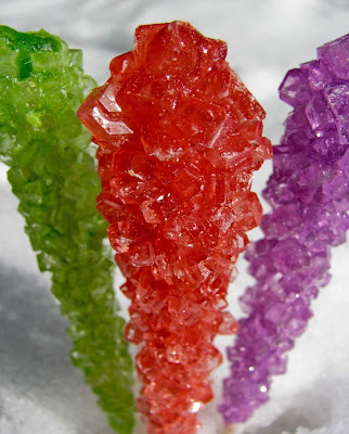
 With Halloween just around the corner, what goes better together than pumpkins and candy? Both of these foods have such a robust and lively texture it really gives both the pumpkin and the rock candy a life of their own.


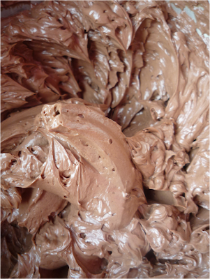
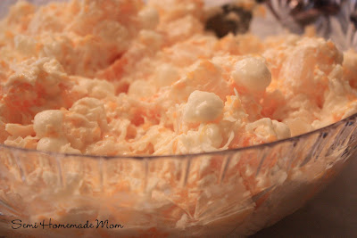
light and fluffy! the pudding ambrosia both have a whipped, airy and light weighted feel to them~


Tuesday, October 16, 2012

Shinichi Maruyama- Water Sculpting


I found pictures of this artist's work on Tumblr the other day, Here is a video of some of his first series of sculptures, named Kusho- which translates to "writing in the sky". Maruyama's work is inspired by his lifelong love of calligraphy.

Kusho- 2006

Maruyama at work


Jamie Hewlett

"I haven't reached the point where I think I'm good at [being an artist]. That's the drive. I know that it's in me to be really good at it, and i think Ive come close a few times... But i don't usually look at things I've completed and feel content. Which then mean the next thing you start you go right into it with that attitude that this time i'm going to get it right."
 
onepieceofcheese:

If this isn’t the cutest thing you’ve ever seen then I think you need to go back and seriously reevaluate all of your life choices
 (From top to bottom: Art for the Opera Monkey: Journey to the West, Tank Girl and Booga, Noseferatu, Animation of 2D)


Jamie Hewlett has held the most inspiration over me by far as an artist. I was captivated by his character designs for Gorillaz and his work for Tank Girl. If it weren't for Hewlett, I dont think I would have such a strong desire to create characters of my own, and to study art. This quote is so great because to hear from my favorite illustrator- that he thinks his work isn't perfect gives me a whole new respect for him. I'm at a point in my work when i am seeing of need for improvement, and to hear my idol share that sentiment makes me confident that everything will keep getting better. 

Tuesday, October 2, 2012

Homework Chapter 5,8,11: PART 2


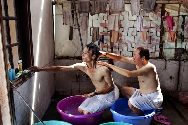
The Pink Choice Part 2 (Ongoing) 2/9- Maika Elan, 2012


This beautiful photograph most obviously shows symmetrical balance upon a vertical axis, the bathing pose is repeated across the photograph.The two men both hold a stance in which their hips and tops of their heads line up in a horizontal placement. Also the laundry that hangs along the wall facing the spectator is aligned horizontally. This piece is very focused on horizontal planes, which create registers that balance the piece very well.There are some very interesting negative shapes that occur in the photo as a result from the contrast of their illuminated skin against the shadowy floor. The perspective of this washroom is of two point perspective, as both the left and the right wall converge into 2 separate points on the wall facing us viewers. This photograph is shot with a Naturalist perspective. Everything in the photograph is as how it would appear had us viewers been present in the washroom. A common tool for creating distortion in photography is the use of detachable lenses such as the "Fish Eye Lense".


Big Daddy Ed Roth

http://www.denslow.com/edroth/dwg_ratfink.jpg

"Whenever I looked at that drawing," Roth said, "I felt I was looking, for the first time, at reality—my reality. The world that my parents, teachers, and responsible type people all around me belonged to wasn't my world. Why did I have to be like them, live like them? I didn't. And Rat Fink helped me realize that."


I love this quote from the Big Daddy.  I think everyone can relate to his feelings of escapism- when I was growing up the world was really quite boring so I'd submerge myself into my drawings and create places and people much more fantastic than the ones I had around me.
 I think it's important to keep that childlike spirit in all you make, so that when someone looks at it they are completely absorbed. To me- that's when you know you've created a successful piece. 

 I liked drawing monsters just like Ed- here's a Mushroom Monster i made back in 2007!


Monday, October 1, 2012

Homework Chapter 5,8,11: PART 1

Chapter 5/8: Balance/ shape and Volume:

  • Describe the difference between balance and imbalanced work? 
    • Balance typically leaves an observer feel more comfortable, whereas imbalance leads to a sense of unease
  • 2.          What is horizontal and vertical placement?
    •  The positioning of an element in design to create balance or imbalance
  • 3.          What is symmetrical balance, and give an art historical example?
    •  Shapes are repeated in the same positions on either side of a vertical axis. Many tile patterns found in Ottoman architecture contain symmetry in their design.
  • 4.          How can asymmetrical balance be achieved with value/color/ shape and texture?
    •  When creating an imbalance of color and value, black against white, a smaller dark object has the same balance as a larger and lighter element. A small textured figure can balance a larger and untextured shape.
  • 5.          What is radial balance?
    •  When all elements of a design radiate or circle out from a common central point.
  • 6.          Give a good example of a piece of artwork?
    •  Circle Limit IV, Heaven and Hell- Mc Escher 
  • 7.          What is a shape and how does it differ from volume and mass?
    •  A shape is an enclosed space. The same shape can encompass many different mass and volumes, wheras those two principles remain constant
  • 8.          What is the difference between naturalism and distortion in art and design?
    •  Naturalism depicts the subject as it would appear to the naked eye. Distortion provides a view of the subject that is not present in nature.
  • Define abstraction: How is your fire and water panel abstract? What concepts are informing your work on this project?
    •  My fire and water panel is abstract because it is representing the theme in a form that is not too literal. I am trying to depict a concept of sensation and tranformation. 

Chapter 8: Shape and volume: 


           Define these terms in art:
  • 1.       Non-objective
    •  art that is not representational
  • 2.          Curvilinear
    •  art that is represented by a curved line
  • 3.          Rectilinear
    •  art formed by straight lines
  • 4.          Positive and negative shapes
    •  Positive space is the subjective shapes in a design, the negative shapes are what appear around the elements of the design


Chapter 10:
  • 1.          List three ways to depict illusion of depth
    •  Size, Overlapping, Vertical Location
  • 2.          What is one point perspective?
    •  When a single point is placed on the horizon line and all the lines at right angles to the plain of the canvas converge toward that point
  • 3.          Two point perspective?
    •  all edges recede to two points on the horizon line
  • 4.          What is an isometric projection?
    •  three coordinate axes appear equally foreshortened and the angles between any two of them are 120 degrees
  • 5.          What is equivocal space? Find an example

Monday, September 24, 2012

Fire and Water Panels: Day 3


So heres what i added to my drawing from the last post:


I think that the rounded form of the water droplets makes for an interesting piece when juxtaposed against the sharp pointed edges of the flames.


After scanning that in I went on Photoshop and adjusted the Threshold, and (roughly) erased the flames that were under the new water drops i had drawn in. These water lines were drawn with a brush tip marker, and I am really enjoying the boldness of the lines, as they create a focal point of the fist.I am not sure whether or not I will want to add the same amount of pointillist gradation within these forms, because i believe it would make them too dark- thus getting lost within the dark and concentrated flame pattern i have already. I'm going to have to play around with it and see what happens :P


Next post: I hope to have my composition planned out on Photoshop, ready to be drawn on Bristol!

Sunday, September 23, 2012

Fire and Water Panels: update 2

So here's that water i promised the other day:

I am trying to create a form for my water that depicts movement, along with a weightless feeling.

 I am trying to create a form for my water that depicts movement, along with a weightless feeling. 

If you can see, here i was experimenting with differet types of marks i could use to give depth to my water droplets, i ended up choosing the pointillist gradation.  


So now that i had decided on the way in which i would portray the elements of Fire and Water, I began to take a closer look at my composition and think about what the concept of my piece would entail. My first thumbnails showed very literal interpretations of the prompt "Fire and Water". Id drawn a wall of flames meeting a wave, a collection of ripples framed by a waterfall. I was rather disappointed in myself, as I found them to be stale and unoriginal. Nothing in these drawings ignited excitement to complete the project, which can lead to a tedious and unhappy work period. 

So I unsheathed my mighty iPad and began to think about other things involving fire and water that interested me. And who would know fire better than Jonathan Storm, the Human torch.  


The Human Torch fighting Nazis on the cover of Marvel Mystery Comics # 36, Cover art done by Alex Schomburg, 1939
The Human Torch- drawn by John Byrne during the "second golden age" of Fantastic Four comics 1981-1986


The Human Torch is a very interesting character to look at, because he offers a multitude of artistic depiction of fire. Here in both of these classic looks, the lines on his body give tone and muscle to the form, as well as creating a "charred" appearance. Ive always loved this design because it gives the viewer something that is perceived- rather than observed.


So now I had an idea- fire people! From my observations of the Human Torch's physique, the arms in particular captured my interest. I believe that arms and hands always make for a strong image, because they are tools that can be used to destruct, to build etc. So Flaming arms.

Next I went to one of my favorite resources for drawing- www.istockphoto.com
Seriously people, they have a photograph for everything. It is a great place to find reference pictures for a project. So I searched "arm with fist" and this is what i setteled upon:


Pretty Nifty huh? Next i looked up "icicle" and chose this image to work with:


Then i set my markers to work!
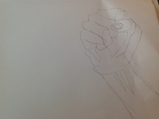

Here's my primary outline drawn with a 005 point marker. I made shapes of all the different planes and shadow values i saw in the fist.


Next I added in that icicle and went over the fist with a 05 point marker. I created harsh, high contrast shadows to create a graphic form for the ice, and i also outlined light reflections with a 005 point.


Flame on! I wreathed the wrist in a concentrated circle of flame created from the shapes i constructed in my previous post. I added spaced out accents on the fist, so that the icicle would not be lost in my fire patterns. 


I didn't do it on purpose, but doesn't this drawing remind you of a certain iconic image from '78?
Artist unknown, Poster for the Theatrical Release of John Carpenter's Halloween, 1978

Anyway.. this week i hope to scan in the work i have so far and play around with it on photoshop, see what else my drawing could be. 

Next time- Fire Pannel Drawing: Bigger, Better and more progressed than before!


Thursday, September 20, 2012

GREAT PANELS OF FIRE!!!

This is some practice I have been doing for the fire panel project. I'm not quite sure what my composition will be in the end but I'm just exploring flame texture for the time being. Next to come- H2O!

Wednesday, September 12, 2012

DESIGN STUDIO 2D: RETURN OF THE COMPOSITIONS

SO last week's class involved lots of gluing, as we took apart our taped constructions to add rubber cement. This was a helpful process because it gave me a chance to look over my compositions and tighten up my shoddy scissor work, some of my designs took a drastic change from my original concept (for the better i hope)


WOWEE HOMEWORK! (part 2)

"Wasted Youth"- Tim Noble & Sue Webster, 2000
Trash, replica food, McDonalds packaging, wood, light projector
210 x 134 x 66 cm (822/3 x 523/4 x 26 in)

This piece by Tim Noble & Sue Webster is an excellent example
of Focal Point, Contour, Implied Line, Psychic Line and Progressive Rhythm. 
      One of the things i find alluring in this piece is that not one, but two focal points have been created in the composition. The first focal point is the trash, which catches the eye due to it's colorful contrast to the rest of the room, which is dark. The second point is brought to our attention because it is positioned parallel to the first focal point, and this time it is the contrast of dark against color that creates emphasis. In the task of explaining and exemplifying contour, shadow art provides us with a strong and clear definition. While the shadow creates the form its self, the light from the lamp that surrounds the shadow acts as a contrasting contour that allows our brain to perceive an outline to the subject in the composition. In shadow art we see the contours of many different shapes combine together to construct a collective contour of a new form.
      The alignment of the rubbish in the foreground creates implied lines, one running along the bottom of the pile, as well as the top. The second body in the shadow also leads our eyes upon an implied line. The two shadow figures create psychic lines pointing upward, following their field of vision. I can also see psychic lines in the garbage, the similarity of the two Mc Donald's cups on the bottom right seem to be connected, as well as the the two yellow cups in the holder on the left. Color companionship is a large psychic component in this piece. I believe that a progressive rhythm is taking pace within the second body in the shadow. The sinking from the neck rises again to the hand on the stomach which falls and rises again to the second hand, then sinking again to the knees. This change in levels has a great ebb and flow, and a continuous change. 


WOWEE HOMEWORK! (part1)

vocab:

Focal Point: 
point of emphasis in a design
How can a Focal Point be achieved?
1) Placement
2) Contrast  
3) Isolation
Rhythm: 
1)Alternating Rhythm- elements of a design alternate consistently with each other to create a unified pattern 
2) Progressive Rhythm- repetition of a pattern that changes in a regular manner, changes different forms into a converging sequence
3)Polyrhythmic Structure- overlay of several rhythmic elements that create a chaos and control in a design
Kinesthetic Rhythm:
Rhythm set in motion
Line:
A point with no dimension, set in motion
Contour:
Defines the visible boundary of forms and shapes
Gesture:
Defines the movement and action of subject and forms
Implied Line:
A series of points positioned so that the eye automatically connects them
Explicit Line:
Line presented obviously
Lost and Found Line:
Only part of the subject is represented by line until the line exits view of the design
Line as Direction:
Horizontal, Vertical, Diagonal
Psychic Line:
A mentally perceived line, created from the gestures of the subject
Line as Texture and Pattern:
Cross hatching, values used to create textures

Tuesday, September 4, 2012

Compositions with Abstract Lines

 so last week in 2D Design studio....

      class went about creating compositions from the abstract expressive lines that we had created the week before. the prompts for our compositions included 
  • portraying emotion
  • creating textured patterns
  • and a personification of abstract form

Here was my first shot at showing the emotion "angst"

Another variation on the design, not quite what i wanted
BINGO WE HAVE A WINNER, (pay no attention to those polky dots)
Here I am, hunchbacked and hard at work